Favicons 101: Why, What & How
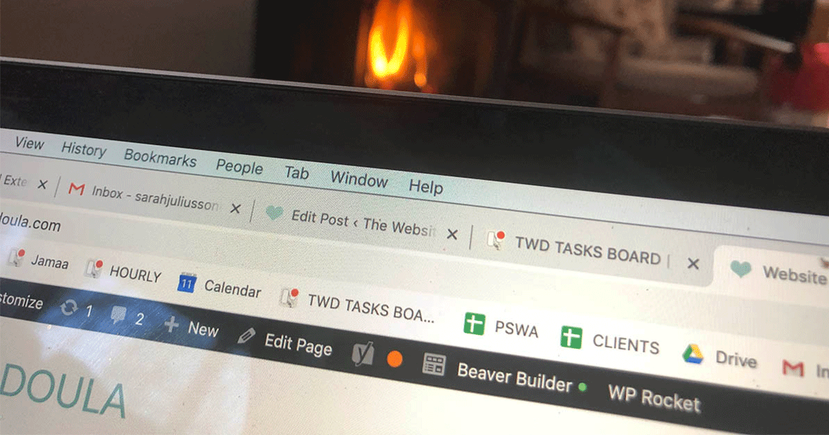
One of the small details of web design I often get asked about is the mystery of the favicon. On Chrome, Safari and Firefox when you open up a website, the favicon appears in the top left of the tab you have open. Over and over again I get questions such as:
How do I make one?…Why does mine look horrible?…Can’t I just use my logo?…How do I install it?
What is a favicon???
Still not sure what I’m talking about? First, let me clarify what a favicon is. The actual word favicon is short for “favorite icon”! If you are on a desktop / laptop computer right now, I want you to look up at the browser tab – above the URL in the search bar. You should see a small teal blue heart, and the beginning of the title of this blog post: Favicons 101: Why, What & How.
A favicon is uploaded on the back end of your website, and depending on your platform may vary in square file size from 32 x 32px to 512 x 512px. The browser tab & more recently search results are the only places this will show up – it’s really just a tiny element of an effective website design. Still, this tiny image can go a long way to making you look more professional & get noticed.
Why did I choose a heart favicon when I’m a website designer? In part because it’s not what you’d expect – a more traditional icon for my business might be a computer screen. I chose to use a heart favicon because of the way that I do my work as the Website Doula. This is not cookie-cutter web design, nor a purely technical endeavour. Not only do I love what I do, but I seek to support my clients with a nurturing, inquisitive style of design that provides an entirely unique experience of website creation.
What happens if I don’t have a favicon?
Now while some of you already have a favicon, it is surprising to me how often I see sites without, or with a favicon so complex you can’t tell what it is. Now, if you don’t have one, it’s not going to have a huge impact on your business. It’s not going to instantly convert a site visitor into a paying client. It won’t make google show you lower in search results.
Utimately, it’s totally FINE if you don’t have a favicon… Instead of a custom image to the left of your browser tab, you will see a simple grey globe – the universal default favicon. But why NOT take an extra 10 minutes to create yourself one?
Here’s how I look at it:
While there are a bunch of things in business that we have no control over (the economy, the unknown factors in SEO, where we live, our competitors’ choices, how often facebook shares our posts with our audience…), there are any, MANY more things that we can control. Having a cute, easily recognizable favicon is one small way you can look just an extra % point more professional and polished. At its best, a well-chosen favicon can reinforce your brand identity, and help your services feel that much more attractive to potential clients.
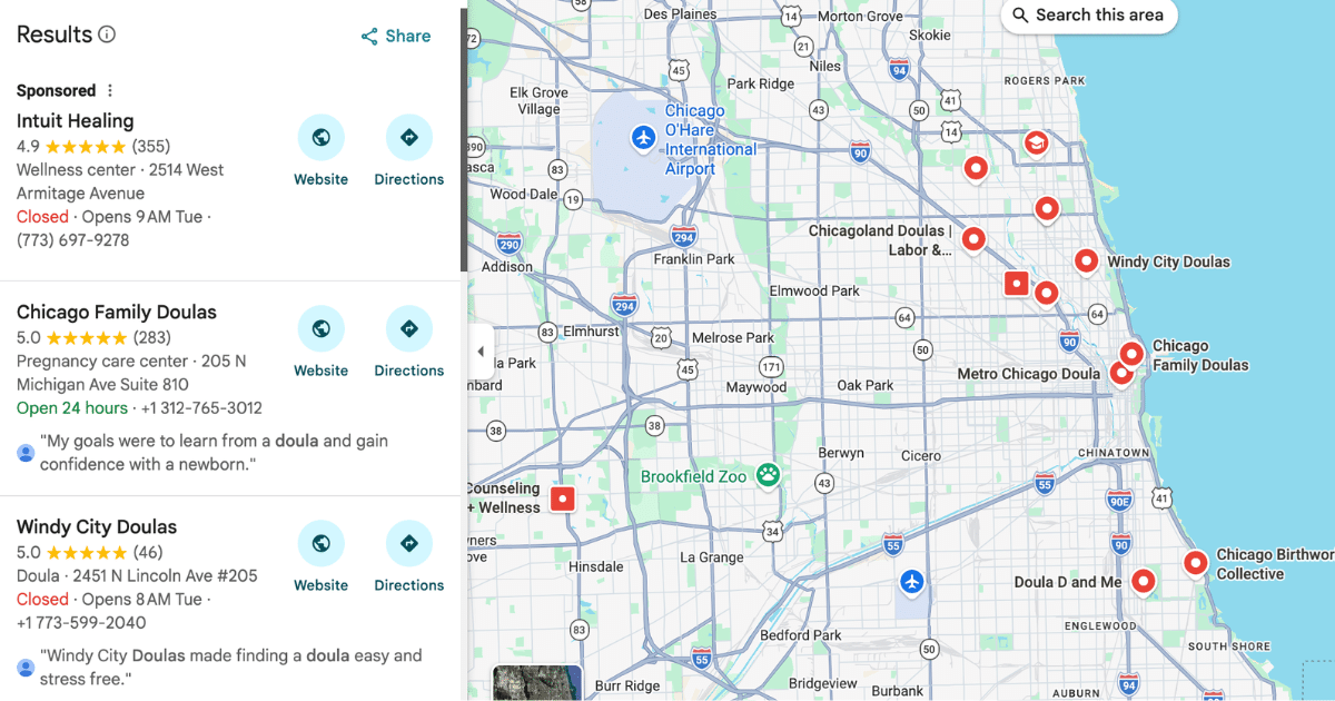
Let’s take Chicago pizza as an example:
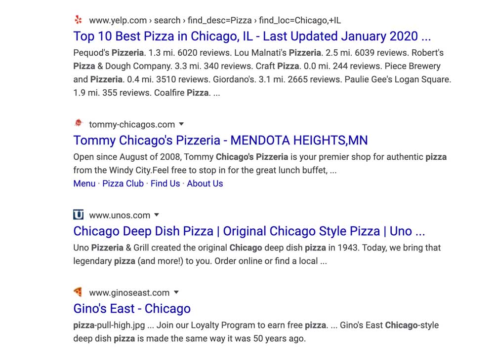
Looking a the first result, the YELP logo is instantly recognizable telling us that we will find reviews on local pizza joints. Tommy Chicago’s Pizzeria has what I can only gather is a splotch of tomato sauce as their icon – less than appetizing and it does nothing to make me want to click. Unos pizza is next, and while their simple U on a blue square background is instantly recognizable and reinforces their business identity, it could be for just about any business that starts with the letter U. Gino’s East wins the best favicon prize here with a fun slice of pepperoni pizza! It’s simple, draws attention, an easily recognizable shape & color, and makes me hungry for pizza – now.
Effective favicon design tips
1) Make sure you pop!
Use a bright or distinctive color that will have strong contrast to a white background.
2) Keep it simple.
Make sure the image is simple enough to be identifiable by the eye as it quickly scans the page. It must be understood at small sizes – on the screen it will be seen as just 16 x 16 pixels – tiny!
3) Align your brand with your favicon.
Choose an icon or illustration that in some way complements your work and brand identity.
4) Design your favicon as a transparent square
Favicon standard sizing is a square. Your website builder will tell you the best size to use – that can vary by builder. I find it best to design it as a PNG image with either a transparent background or a solid color other than white behind it – that way the image has a better chance of standing out against the brower tab without awkward lines around it.
How to make a favicon
I have created a quick video tutorial taking you step by step through the process of creating your own free favicon on Canva:
New to Canva? Join now (free or paid accounts available).
How to upload your favicon on your website builder
How to add a favicon on WordPress
How to add a favicon on Weebly
How to add a favicon on Wix
How to add a favicon on Squarespace
HOW CAN I HELP YOU?
Hi there, I’m Sarah Juliusson, and yes I really am a Website Doula. I design and build doula & wellness websites designed to show up in search and attract your dream clients. With 15+ years in web design, and another 20+ years as a former doula business owner, I believe in the value of your work as much as you do. My clients include Birth Doulas, Postpartum Doulas, NCS Agencies, Midwives, Birth Centers, Chiropractors, Therapists, Wellness Clinics & more. Explore your options for a custom website today.


